Hi,
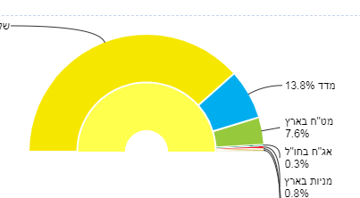
I'm trying to create the attached chart, but I find it very difficult to use color for each slice.
I need the outer graph (first main graph) with one color and the inner graph (the one that appears that I clicked on the main graph) with other colors.
I didn't find any example regard it, help is needed.
Thanks,
Tal Reshef.
[cid:image002.png@01D3DAF1.2AA7CD50]
[cid:image003.png@01D3DAF1.2AA7CD50]
[cid:image001.png@01D3DAF0.5A0E7720]